Client Name: Lytebuy
Project: Website and mobile app
Target Users: Local Vendors and Consumers
Role: Research. Wireframe. UX and UI
Duration: 6 months

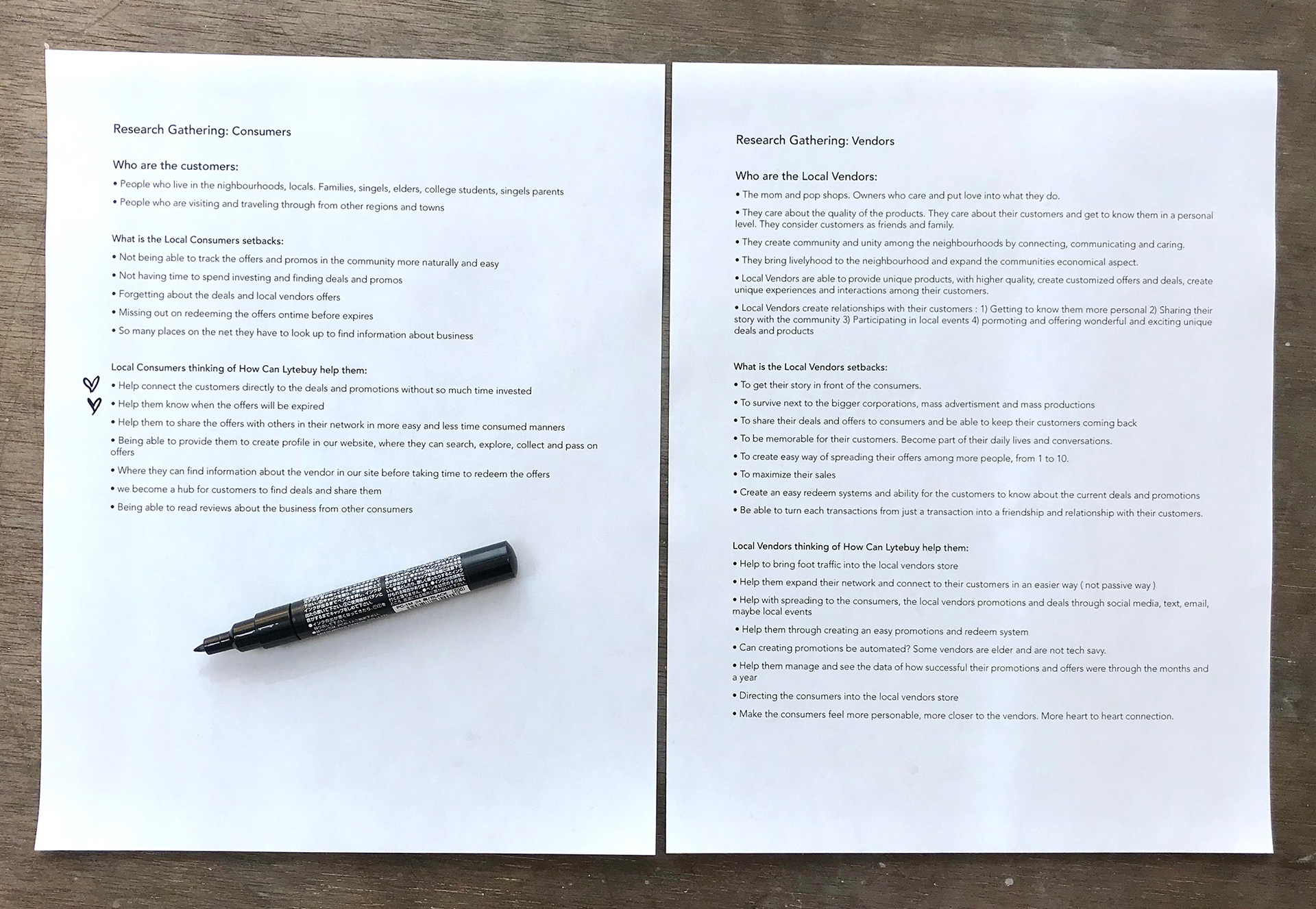
Phase 1: Research
I conducted research based on a sample of local shops in different neighborhoods to understand the needs and struggles that local businesses face. The research focused on the setbacks for small local shops, and how hard it is to bring consumers back to their stores, let the consumers know about their current offers, and how to survive as a business next to the big chain stores.
I also conducted research with a few consumers to understand about their needs and struggles. I learned most consumers prefer shopping in the local stores, but the lack of not knowing which store has the best deals in their neighborhoods will make it inconvenient for them. They prefer to know where the promotional deal is and when they can redeem it.
Phase 2 : Story Boarding
I created a visual imagery of my research for the Lytebuy team, to feel and visualize the vendors and consumers better. The storyboard on the left is about a business owner John, his struggle, steps he takes to make his business grow by using Lytebuy. The storyboard on the right focuses on a single busy mom who loves finding deals but has a limited time. She uses Lytebuy and is able to save time and money.
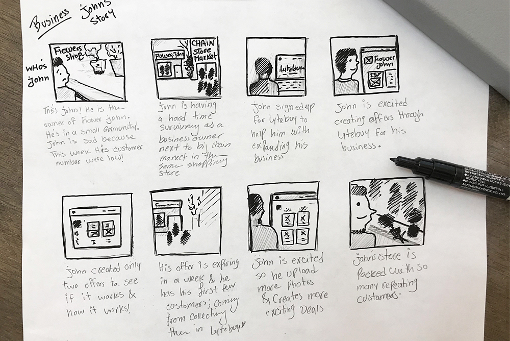
Case Study: John's story a small local business owner that faces struggle next big stores.
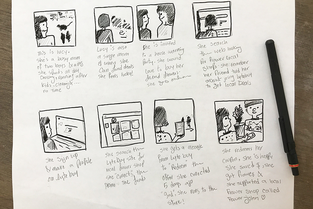
Case Study: Lucy's story a single busy mom that loves saving.
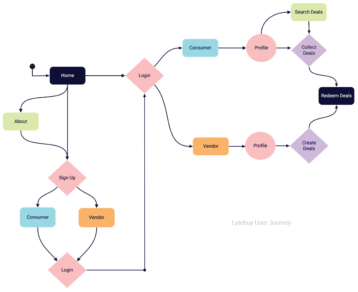
Phase 3 : User Journey
This is a technical drawing that helps to translate my storyboards in order to aid the team to make better technical decisions.
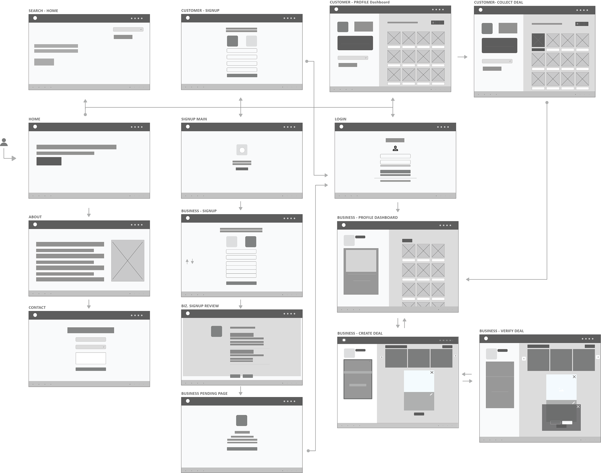
Phase 4 : Low to High Fidelity Wireframes
Low fidelity wireframe : I displayed in this wireframe a user entering the homepage, can be either a vendor or a consumer. The process will be the same until the sign up step, and then they will have separate paths and intentions.
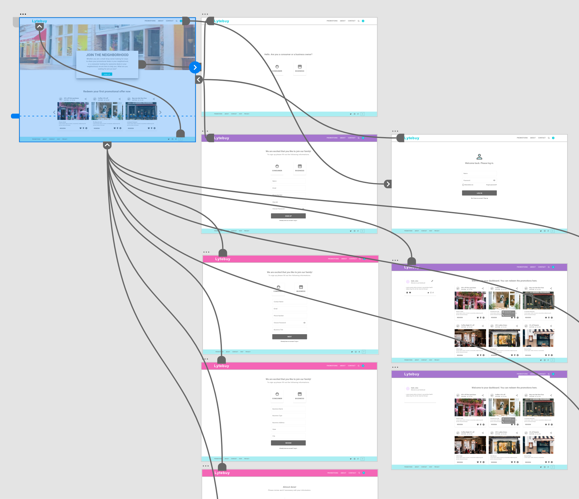
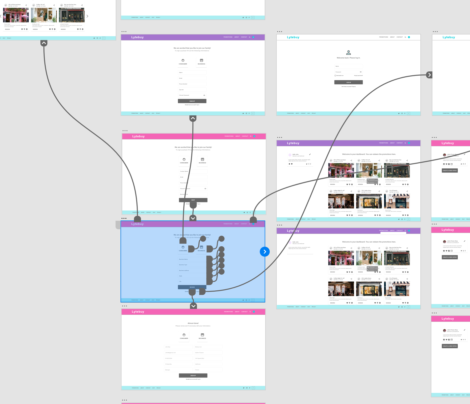
Medium fidelity wireframe : After few discussions over the original sketches and the low fidelity wireframe with the team. The company decided to focus on a new user entering the homepage in this wireframe, and add a few text to clarify and understand what is important and what is not in the website. I created the animated wireframe to assist the team with visualization.
High fidelity wireframe : (working in progress) This stage is going through a few iterations and I am waiting on more information from the Lytebuy team. We are trying to define each page more and add few more pages. One of the concerns was how to separate the vendor and consumer, and I offered the idea of creating different colors for their profile page, maybe the headers can have different colors on a vendor vs. consumer. Also I introduce the idea of using stock images of few local shops in the homepage to create a warm and welcoming feeling for the user. The team really like the idea from their original idea of a colored home page. They also liked the idea of showing a few of vendors promotional offers in the homepage to help the consumers journey and get the vendors promotions upfront.
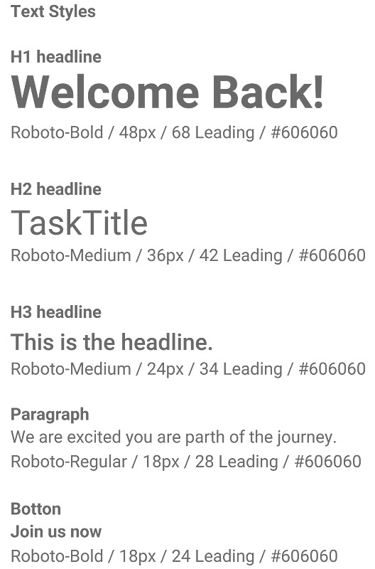
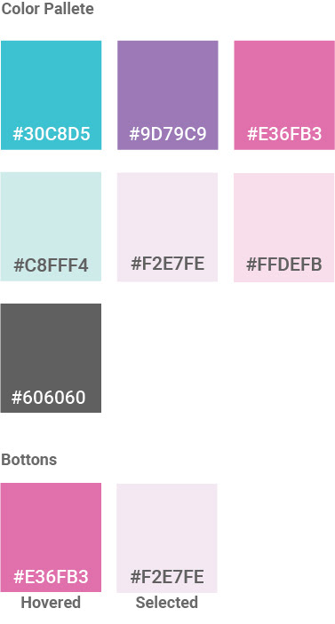
Phase 5 : Visual Design
The visual design is being developed by considering the feelings and moods Lytebuy will have on people through the use of color, typography and style through the website and mobile application. After a few discussions with the CEO and his shared vision on how he envisions Lytebuy to bring lightness, colorfulness and happiness to people, and also target a higher female demographic, we decided to go for brighter colors through the website and app. I am working on the first version of the style guide while waiting for more information from the team.
Phase 5 : Project Summery
The Lytebuy's project could revolutionize the entire community around shopping locally. Attracting more business by connecting consumers with local shop owners. Giving consumers more choice of buying higher quality and unique products. I am waiting for more information to be able to continue on the next iteration of wireframes.