Client Name: Department of Industrial Relations
Project: Logo
Role: Lead Graphic Designer
Duration: Four Months
Logo Concept
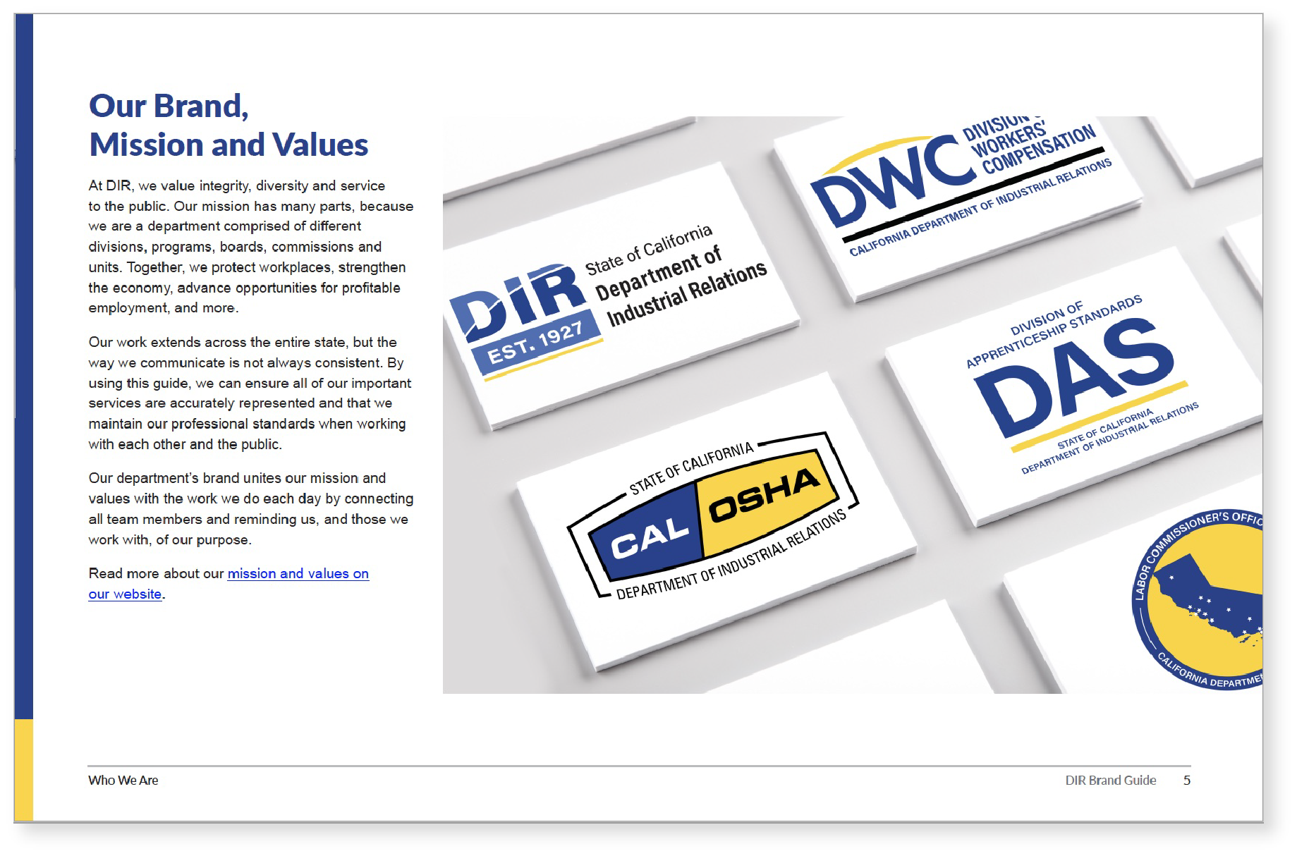
The colors of light blue and dark blue - represent diversity throughout the department, as diversity is one of the main core values of our department. It symbolizes that DIR department is built on the foundation of diverse people.
The white swish - was developed to unite the DIR department with workers and public. It also unites the department internally. It represents our support, work and effort to help protecting workers. The white color symbolizes purity, innocence, wholeness and completion.
The yellow line - is the symbol of stability, positivity and unity between DIR department and the divisions, it is the line that brings us together as a connecting point, to stand firm together for what we value and our mission through the entire department.
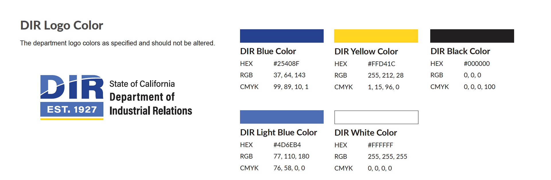
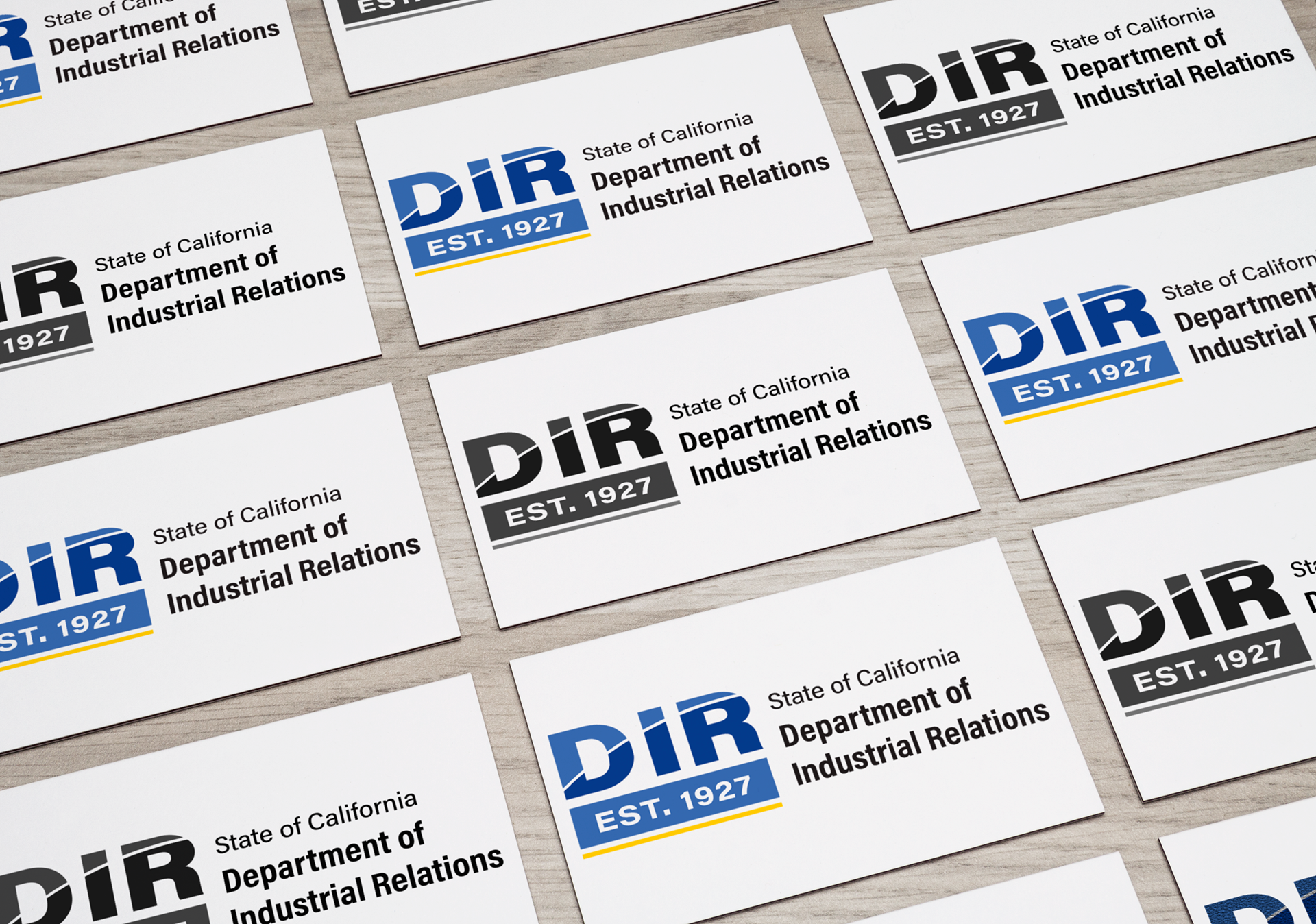
Client Name: Department of Industrial Relations
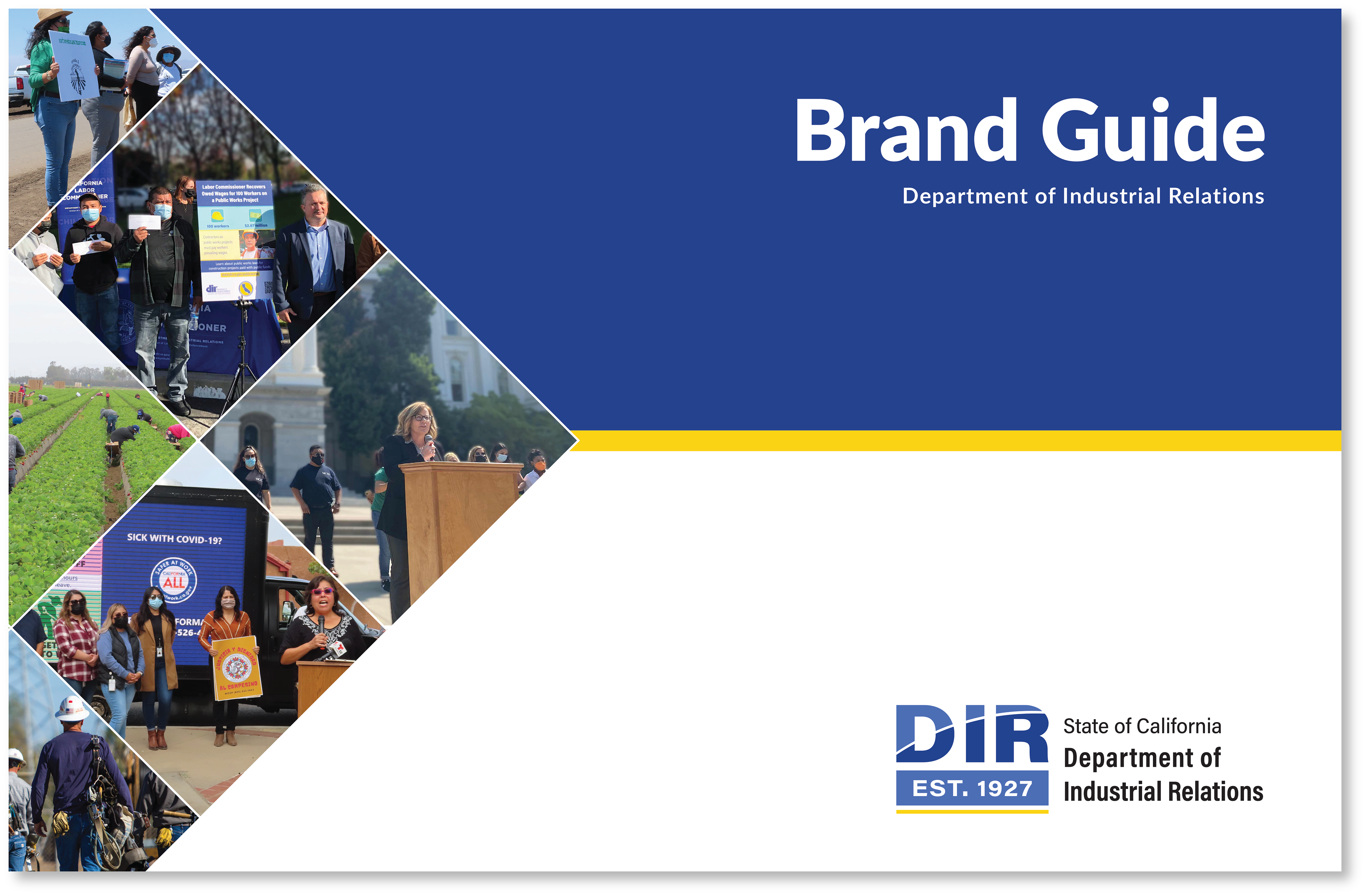
Project: Brand Guide, Marketing Material
Role: Lead Graphic Designer
Duration: Eight Months
Brand Guide
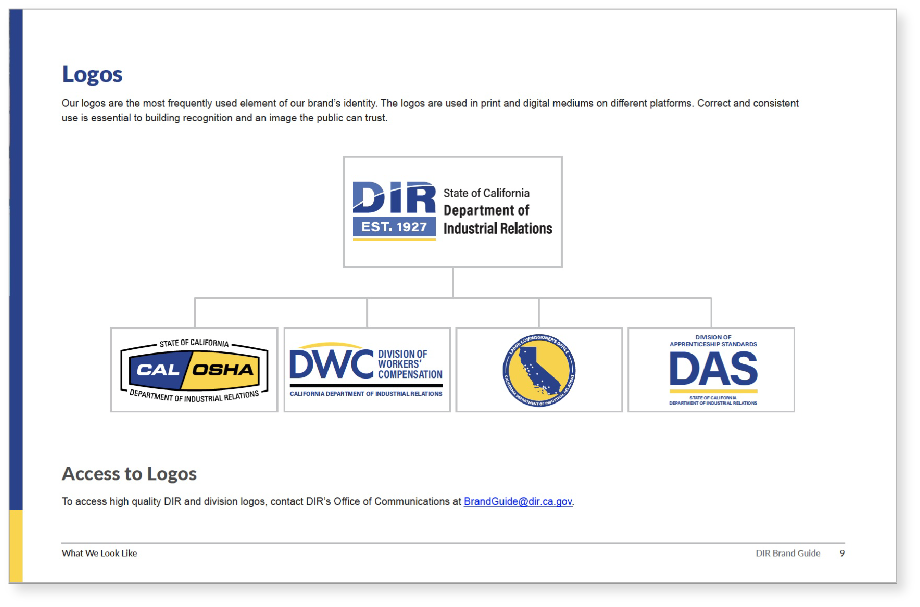
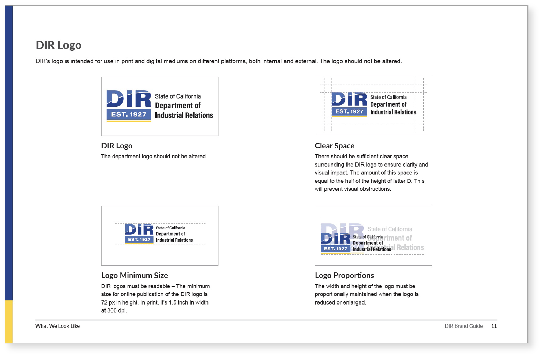
I created the departmental brand guide, as guideline that contains details of departments visual identity, logo usage, font type, colors, imagery, email signature template, and department templates, and department brand’s mission statement and values.
Below are few sample pages: